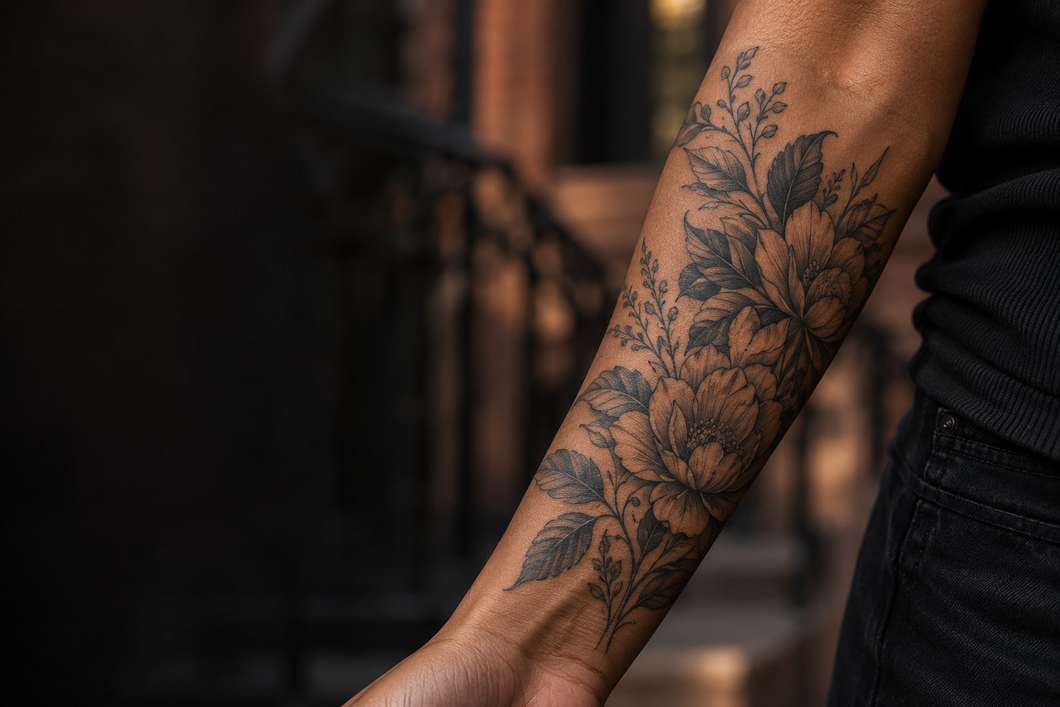
Color Tattooing
Color Tattoos Designed With Purpose
Share your subject and preferred color direction. Get a Free Estimate
Color Tattooing
Share your subject and preferred color direction. Get a Free Estimate
Color can change the entire character of a tattoo. A limited palette can feel controlled and graphic, while a broader range of colors can create richer transitions and more complex imagery. The right approach depends on the subject, style, size, placement, and the relationship between the individual colors rather than simply adding as many hues as possible.
When requesting a color tattoo, references are especially useful. They can show whether you prefer saturated colors, muted tones, traditional combinations, painterly transitions, bright illustrative work, or another direction. The composition can then be developed around a palette that supports the main subject.
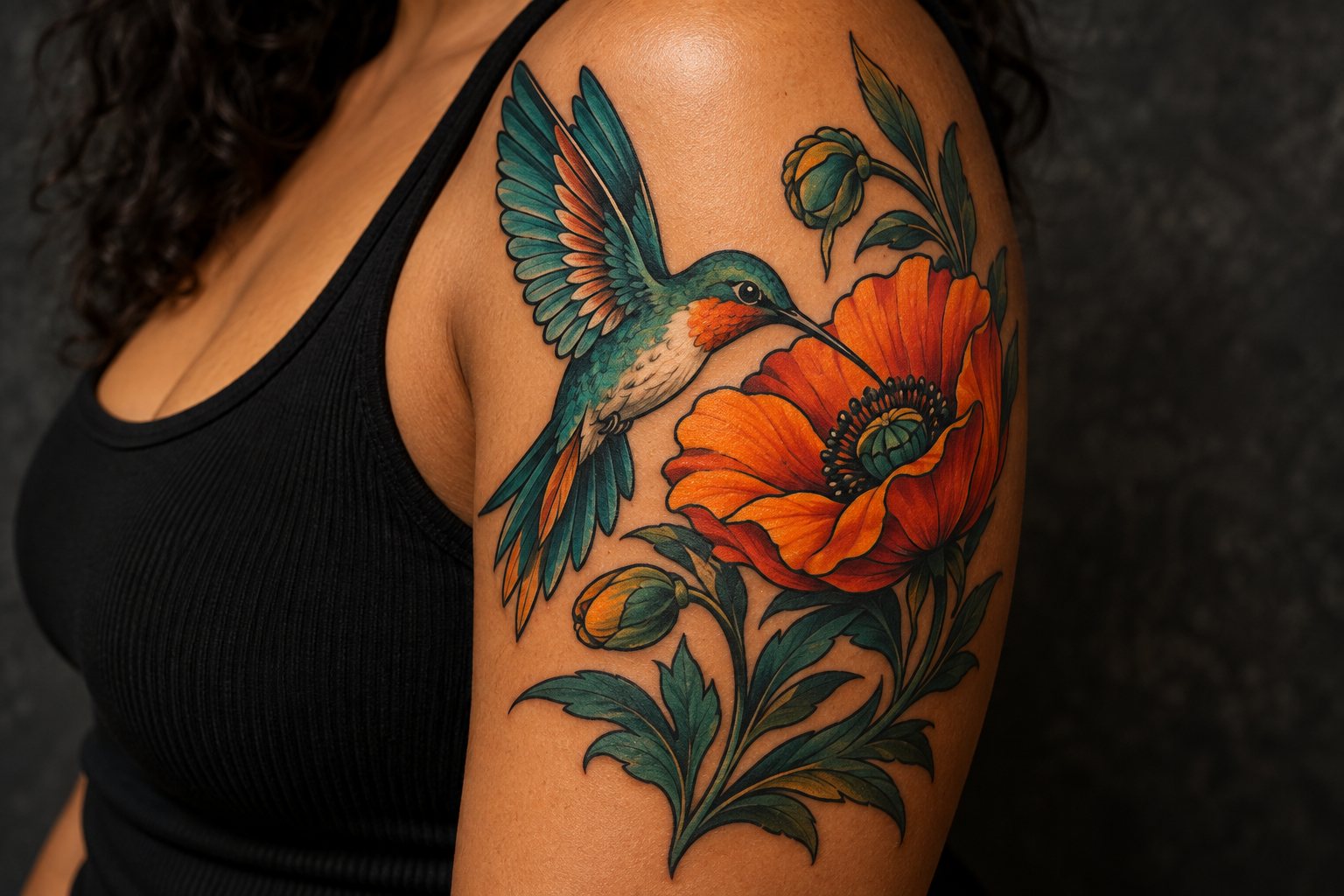
Color tattoos work best when the palette and value structure are considered together. Even a vivid tattoo needs enough separation between major shapes for the design to remain understandable.
Choosing colors with a clear relationship can make the tattoo feel more cohesive. References can help establish whether the desired result is bright, muted, warm, cool, or mixed.
Different colors can still appear similar in lightness. Contrast in value helps important forms remain separate even when several hues are used.
Small areas limit how many individual color transitions can be shown clearly. More complex color work may benefit from additional room.
If new color work will sit beside or connect with existing tattoos, the surrounding palette and visual weight should be considered as part of the overall composition.
| Service | Estimated Cost | Average |
|---|---|---|
| Small color tattoo | Quoted after project review | Varies by design |
| Detailed color tattoo | Quoted after project review | Varies by palette and detail |
| Large color composition | Quoted after project review | Varies by coverage and time |
Color tattoo quotes depend on the individual design, dimensions, placement, detail, palette, and expected appointment requirements.
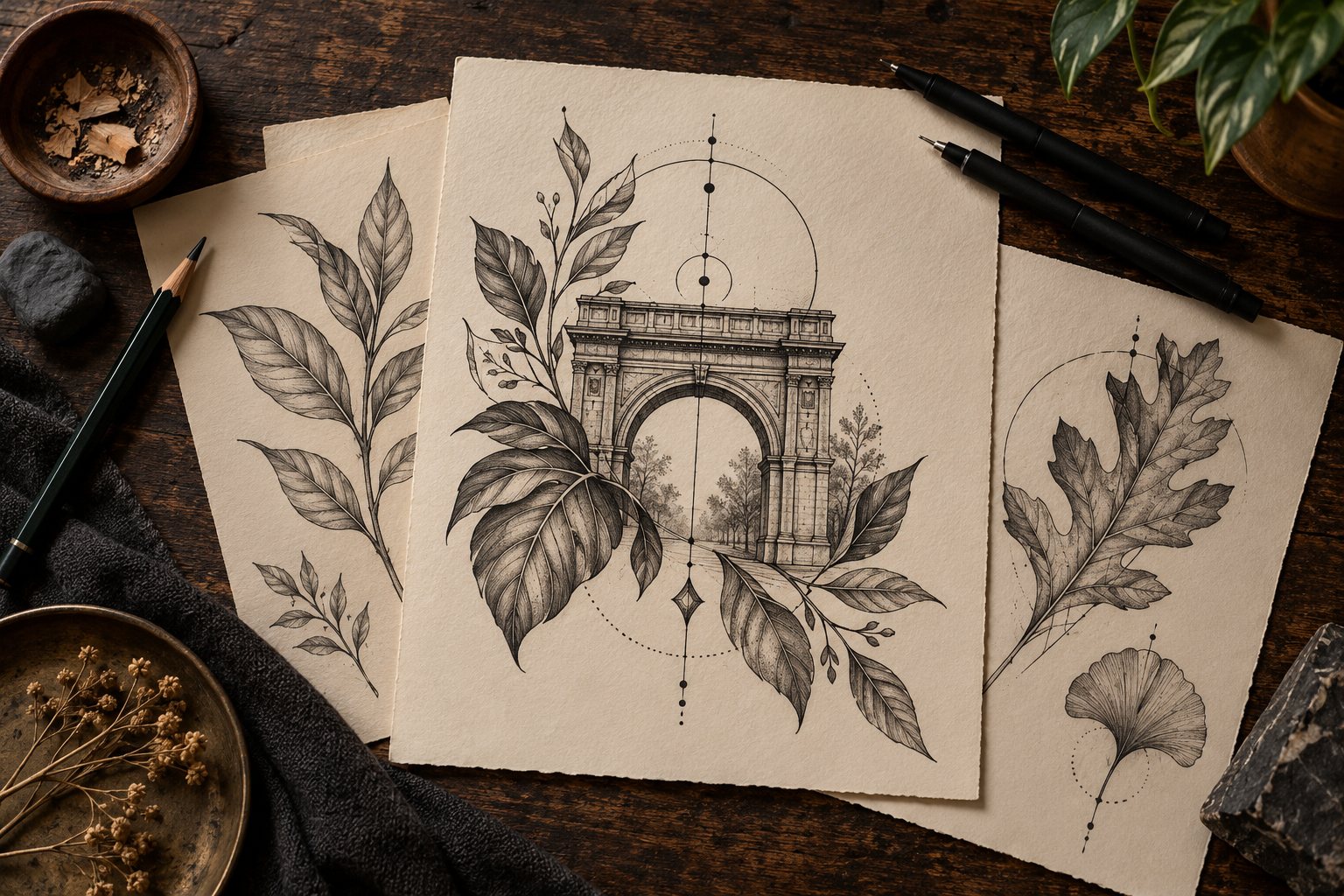
Color choices are considered as part of the composition rather than treated as decoration added after the design.
We consider the light and dark structure of a piece as well as the hue so forms can remain visually distinct.
Examples of the color mood you like can quickly clarify whether you want something bold, restrained, painterly, or graphic.
Send references showing the colors and overall finish you have in mind, along with placement and size.
Free — no obligations
Share the subject, placement, dimensions, and the role you want color to play in the tattoo.
References can help define saturation, mood, and the balance between dominant and supporting colors.
The design is considered for readable shapes, contrast, and a sensible amount of detail at the requested scale.
Once the design scope is understood, appointment details can be discussed.